Countdown to Catastrophe
Client
Personal Project
Longlisted
Information is Beautiful Awards 2022
See More
Download a high res version of the data visualization here
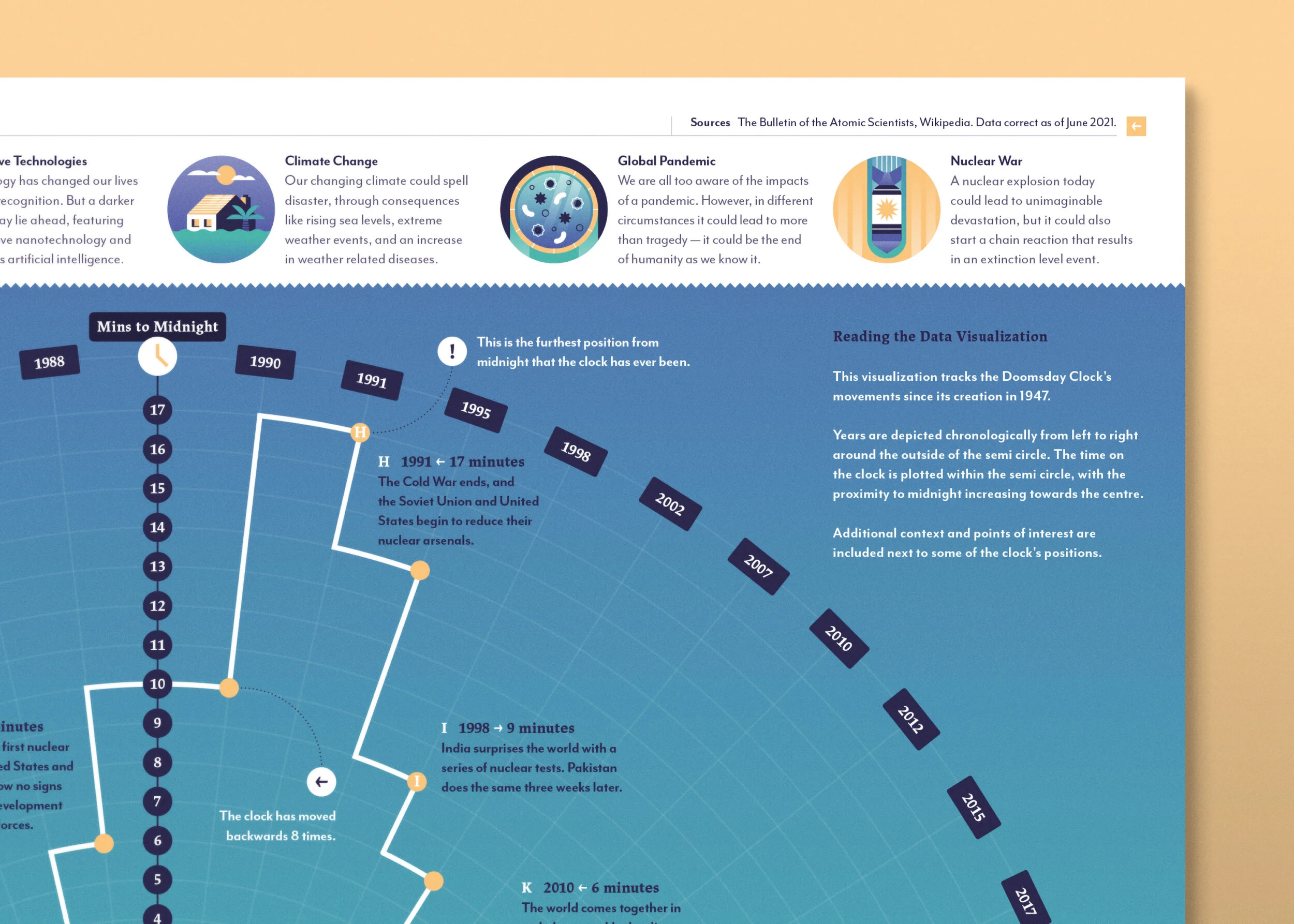
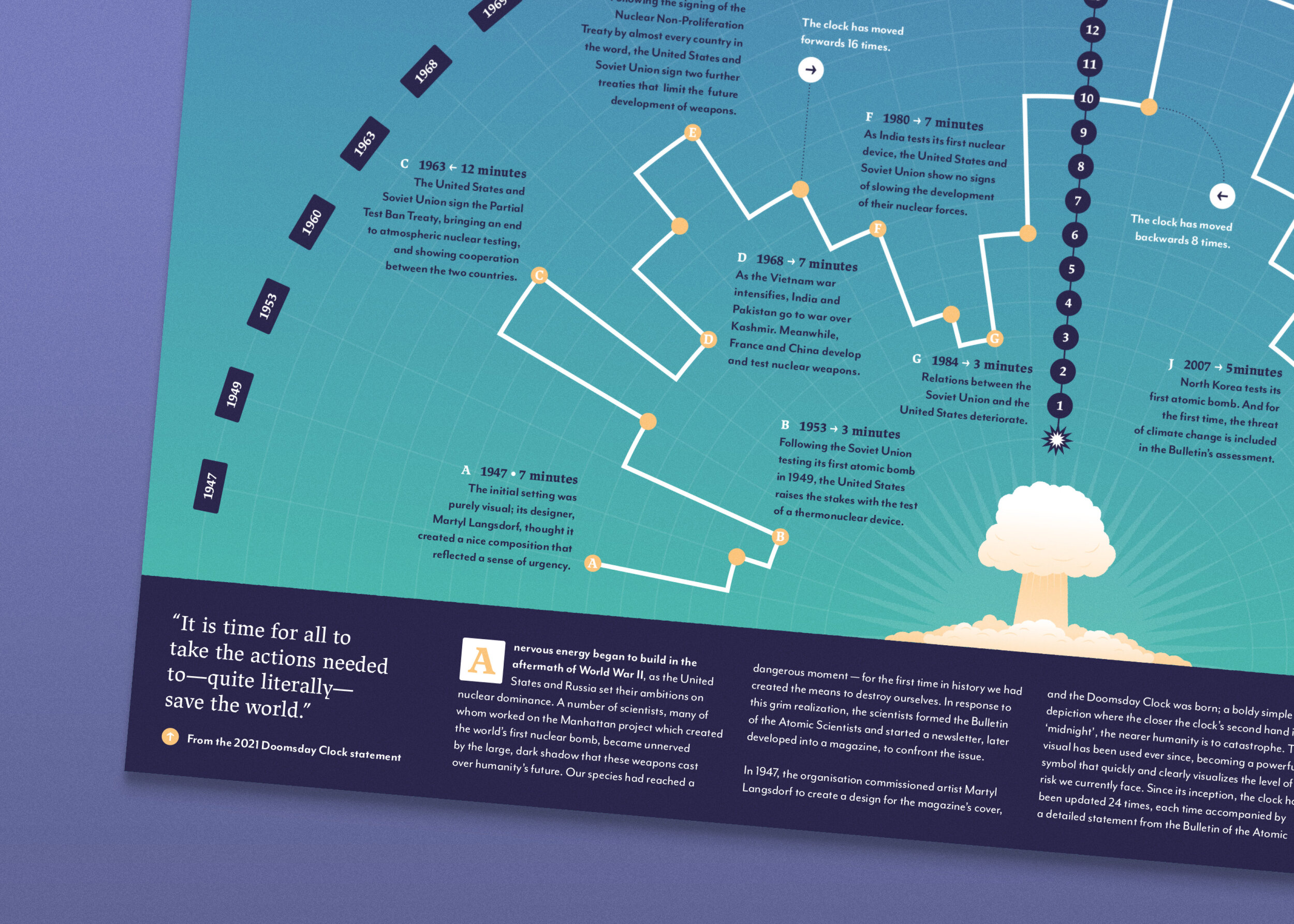
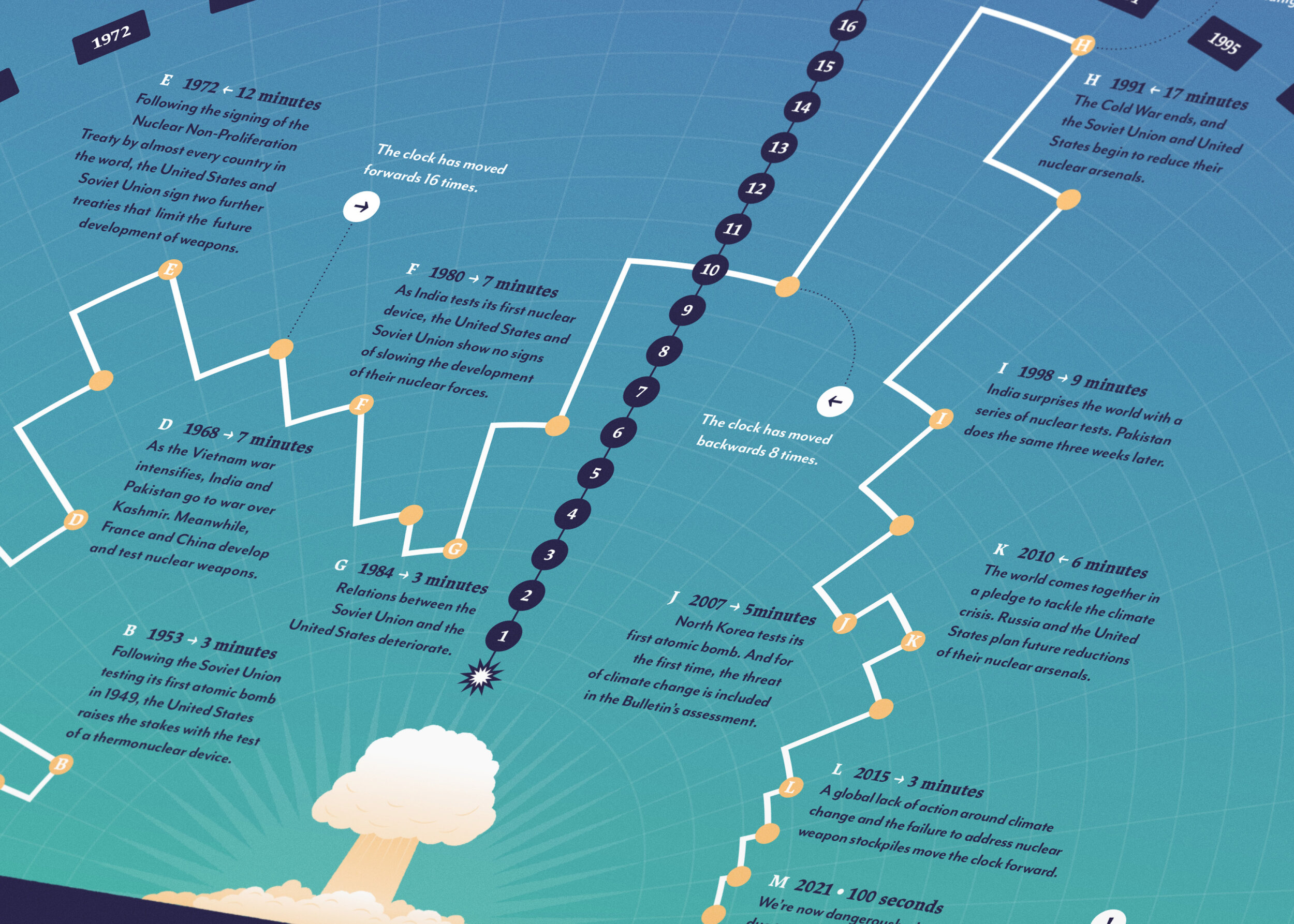
A data visualization tracking the history of the Doomsday Clock, a powerful metaphor that calculates our proximity to extinction.
In 1947, the Bulletin of the Atomic Scientists commissioned artist Martyl Langsdorf to create a design for their magazine’s cover, and the Doomsday Clock was born; a boldy simple depiction where the closer the clock's second hand is to ‘midnight’, the nearer humanity is to catastrophe. The visual has been used ever since, becoming a powerful symbol that quickly and clearly visualizes the level of risk we currently face. Since its inception, the clock has been updated 24 times, each time accompanied by a detailed statement that further explains the reasons for the clock's position, alongside practical steps to avert disaster.
Today, the issues that first provoked its creation persist, while newer dangers like climate change and the risks from emerging technologies like artificial intelligence inch us ever closer to extinction. Over the last decade the clock has only moved in one direction, now leaving seconds, not minutes, to avert potential disaster. However the clock isn’t just meant to provoke fear, but rather inspire action; it’s a catalyst for us to seek out a safer future, and while we can’t change the mistakes of the past, at least through this metaphor we can turn back the clock.
This data visualization tracks the movement of the Doomsday Clock since it's creation, providing context and points of interest through the clock's history, and explores why today the symbol is more important than ever.


