UK Tech: The Network Effect
Client
WIRED
Winner
Creativepool Awards 2020
Longlisted
Information is Beautiful Awards 2019
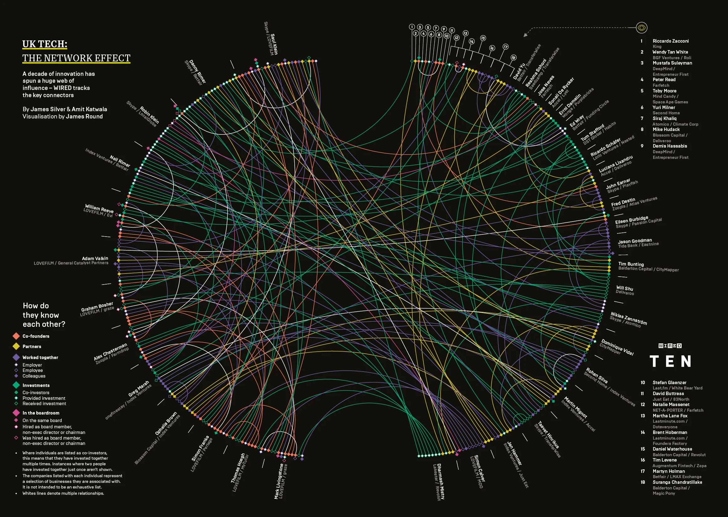
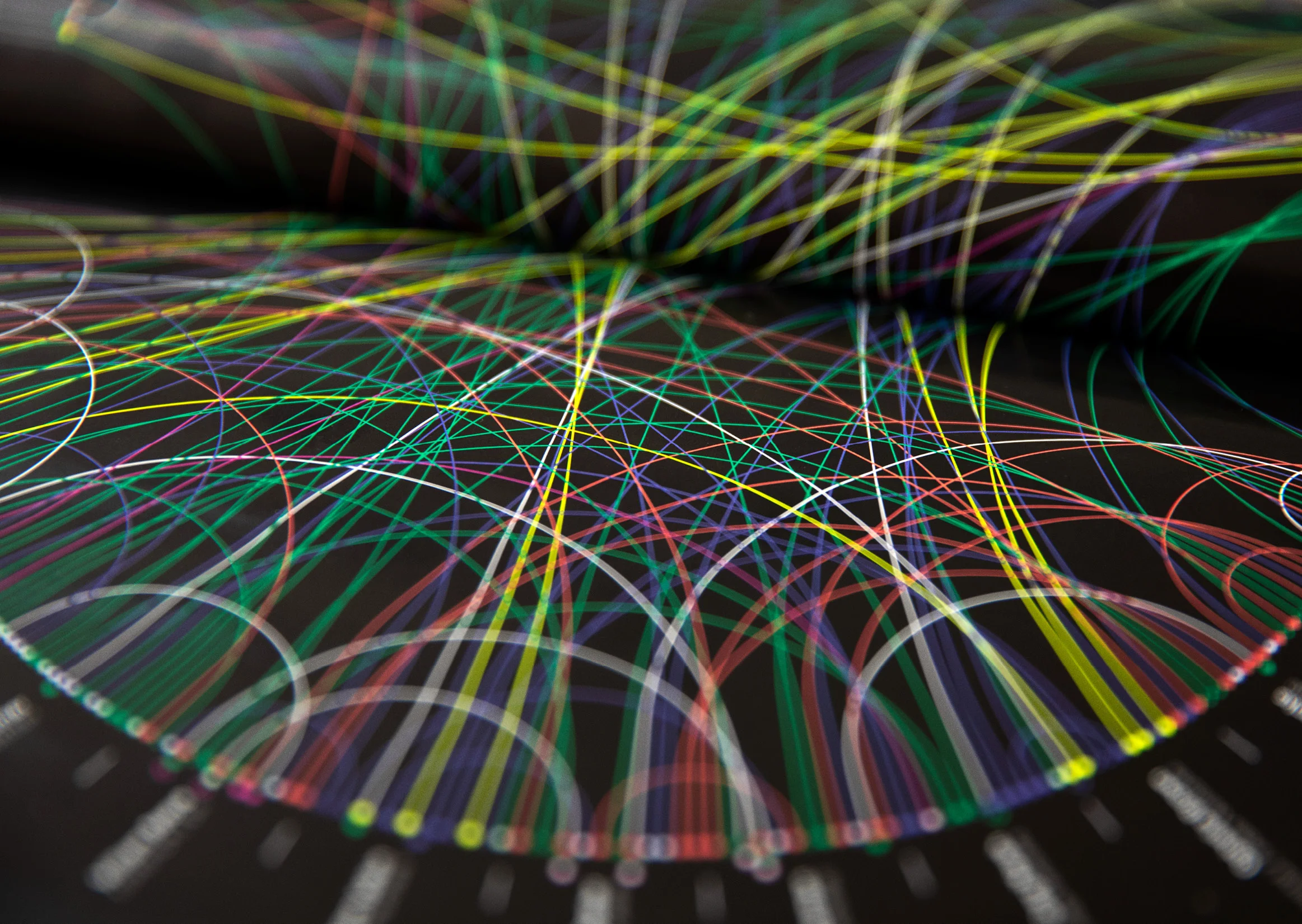
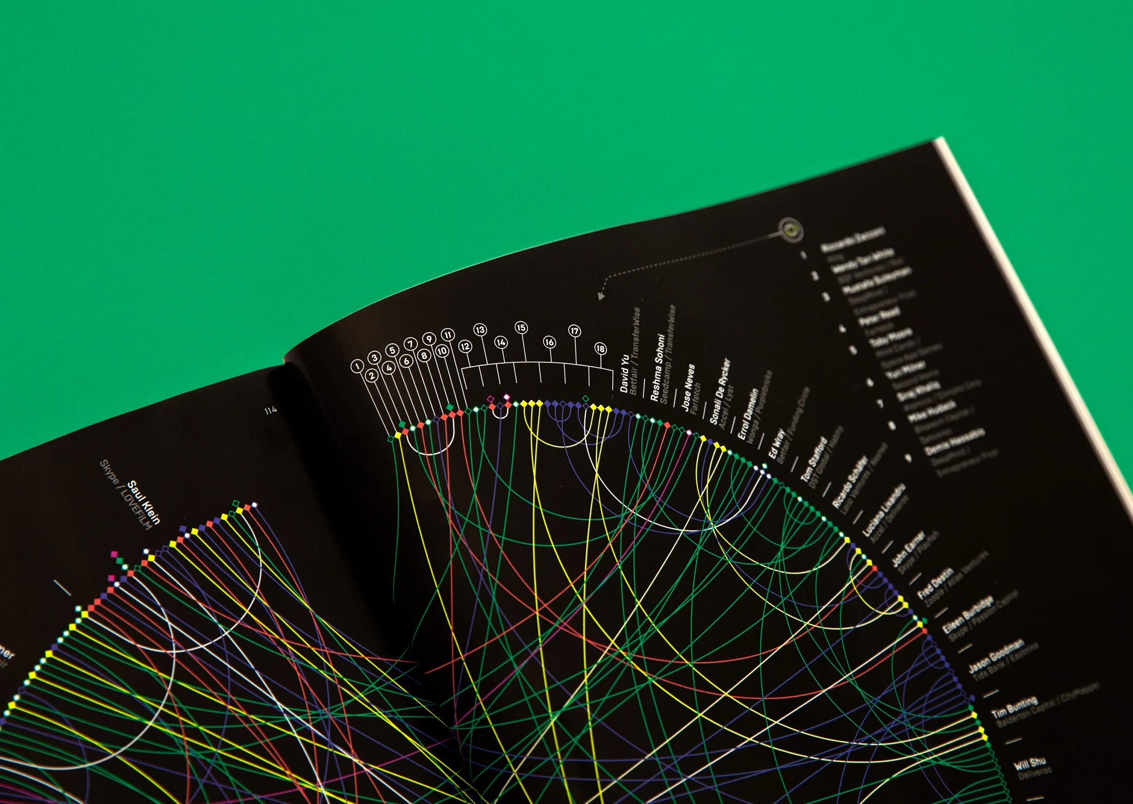
A complex data visualization plotting the relationships between the biggest names in the UK tech scene.
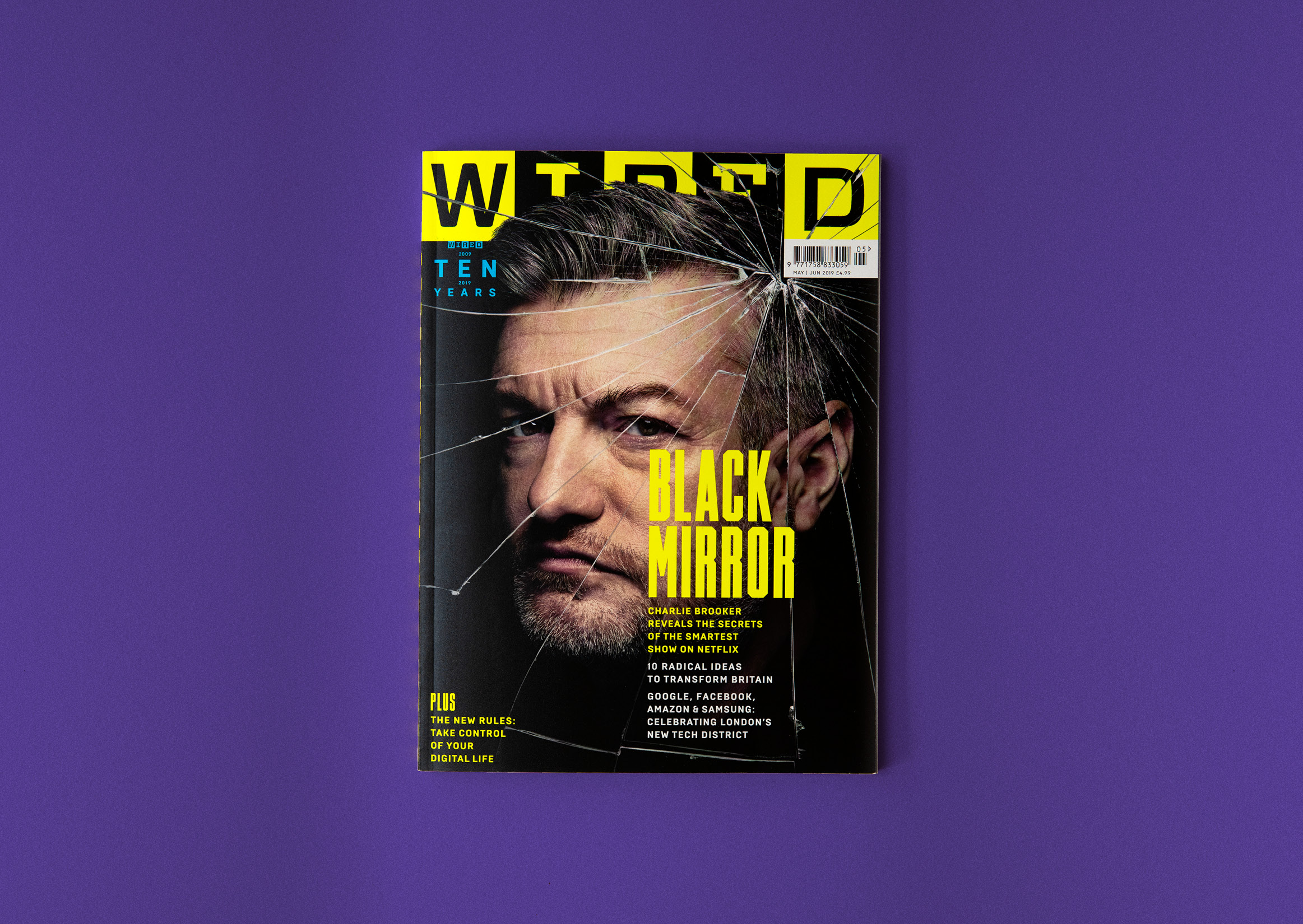
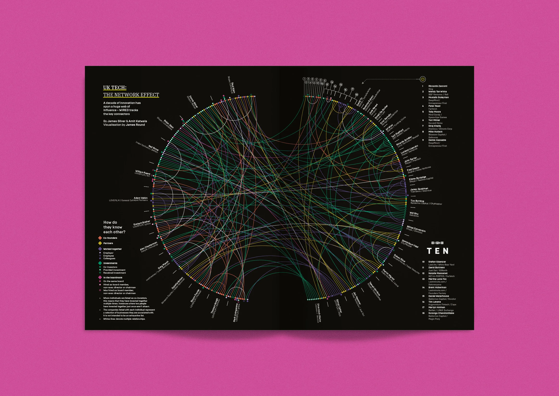
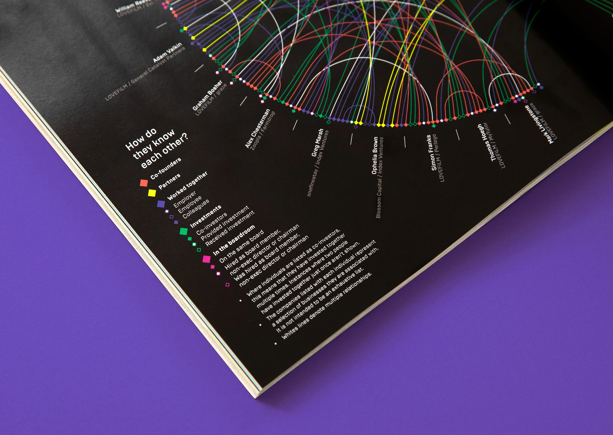
For their ten year anniversary issue, WIRED magazine asked me to create a detailed visualization to accompany an article about how the UK tech industry has flourished over the last decade. The piece looked to map how individuals knew each other and the nature of their relationship. The data set for this project was huge, and presented something of a challenge when it came to creating a structure that could legibly display everything within the confines of a double page spread.
After working through a few options that weren't quite right, I landed on a chord diagram as the most effective composition, that resulted in a finished visualization that looks wonderfully complicated, but remains easy to follow.


